Brand Identity · Packaging Design
Hareer Baby
A gentle identity for little everyday moments.
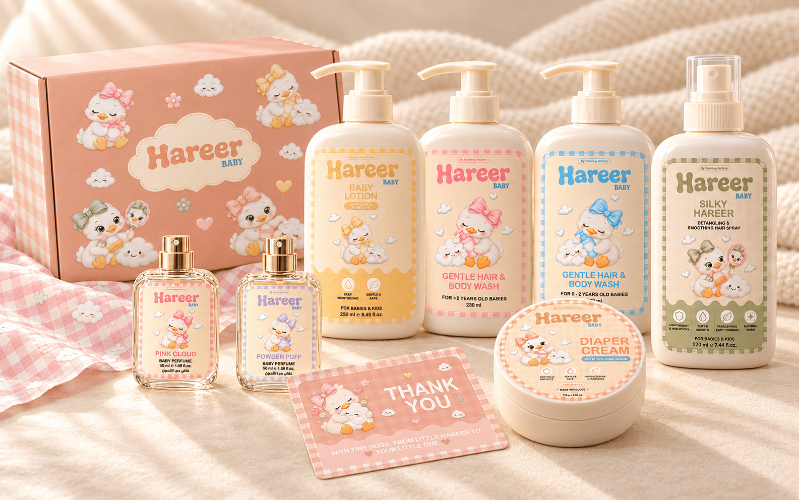
Hareer Baby is a baby-care brand by Foaming Factory. Its identity brings together soft pastel colors, playful duck illustrations, and gingham patterns to create a warm, recognizable collection. Each product has its own color and illustration, while consistent layouts connect the range. The design extends across product labels, gift packaging, wrapping paper, and thank-you cards.
“Softness in every little detail.”
Create a baby-care identity that feels gentle and playful while keeping product information clear and making each item easy to distinguish.
Build a familiar little world around a duck character, using soft colors, clouds, and gingham patterns to connect everyday care with comfort and affection.
Mark The Hareer wordmark uses rounded, flowing letterforms to express softness. The smaller “BABY” lettering completes the mark without competing with its playful shape.
Each product pairs a distinct pastel shade with a duck illustration that reflects its use. Consistent borders, icons, and layouts bring the collection together, with the same visual language carried through the box, wrapping paper, and thank-you card.
Rounded display lettering gives the brand its friendly character, while clear supporting typography organizes product names, benefits, and instructions in English and Arabic.