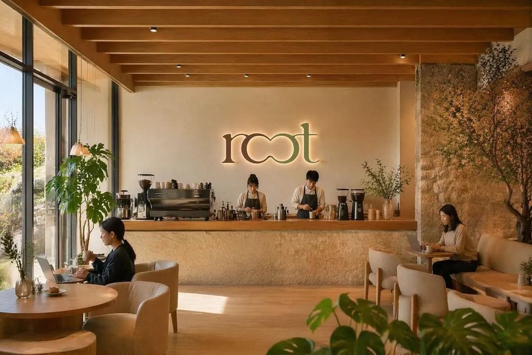
Root
Café & Matcha Bar
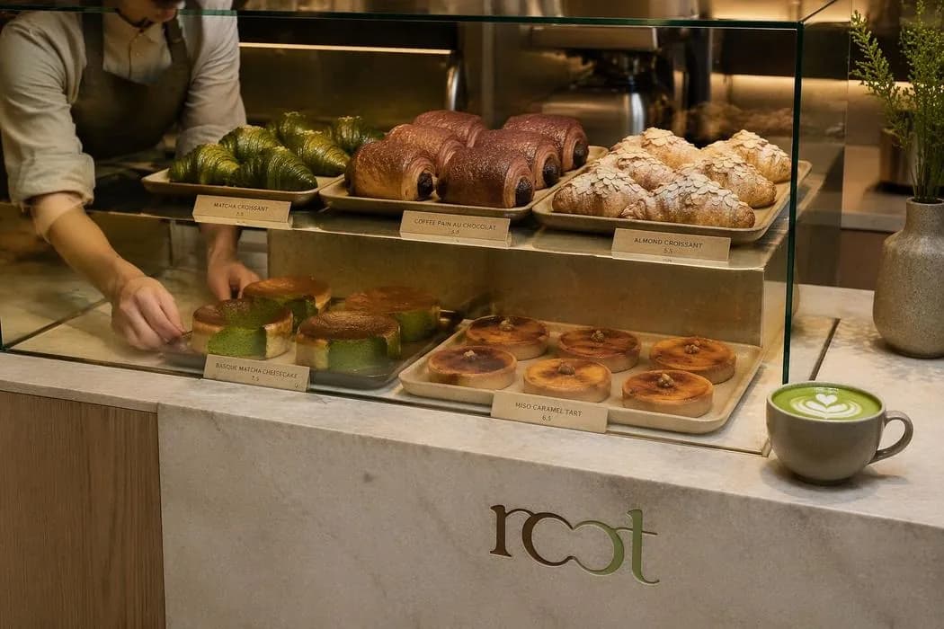
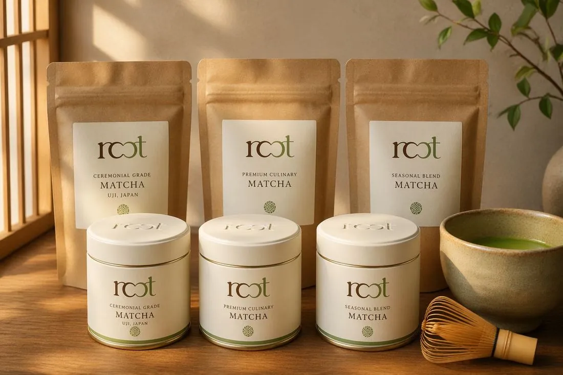
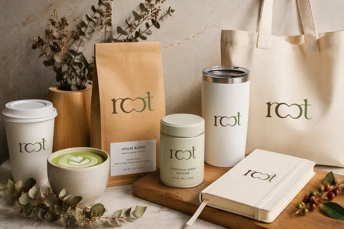
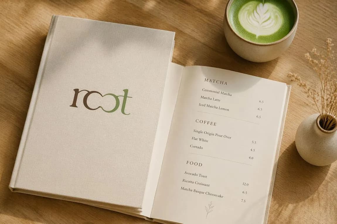
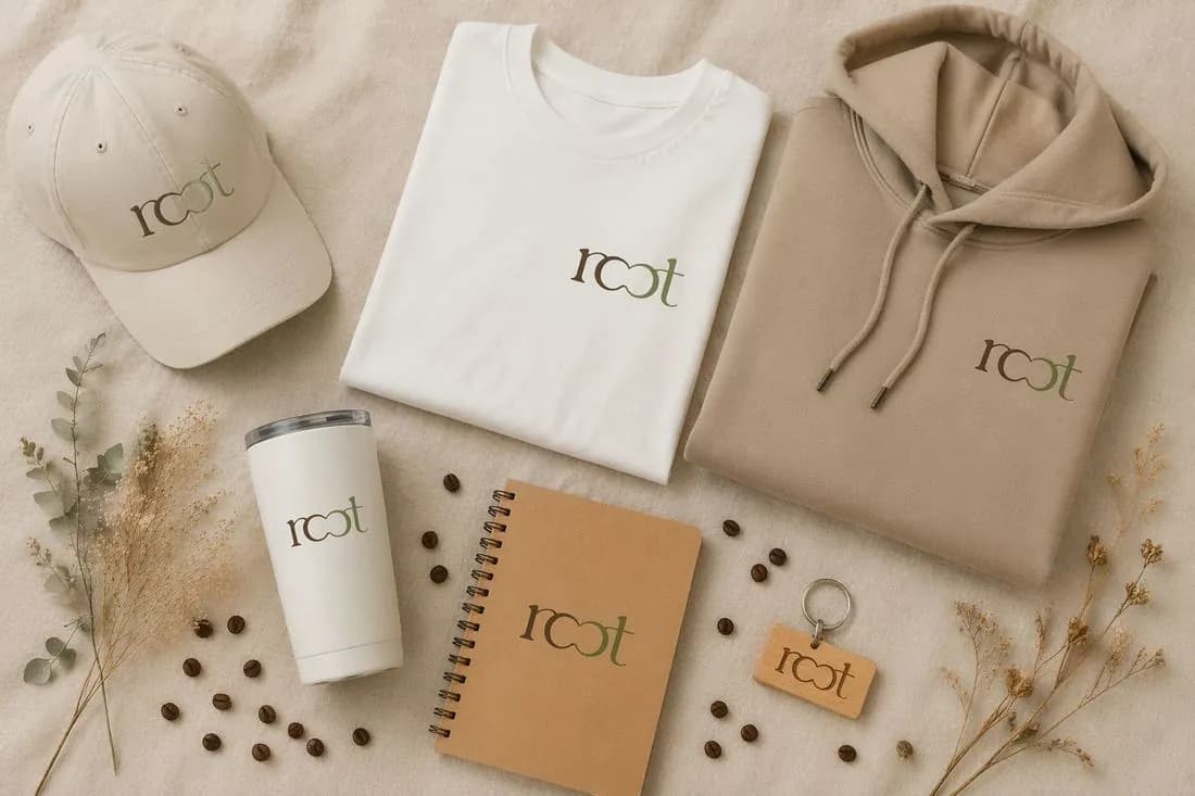
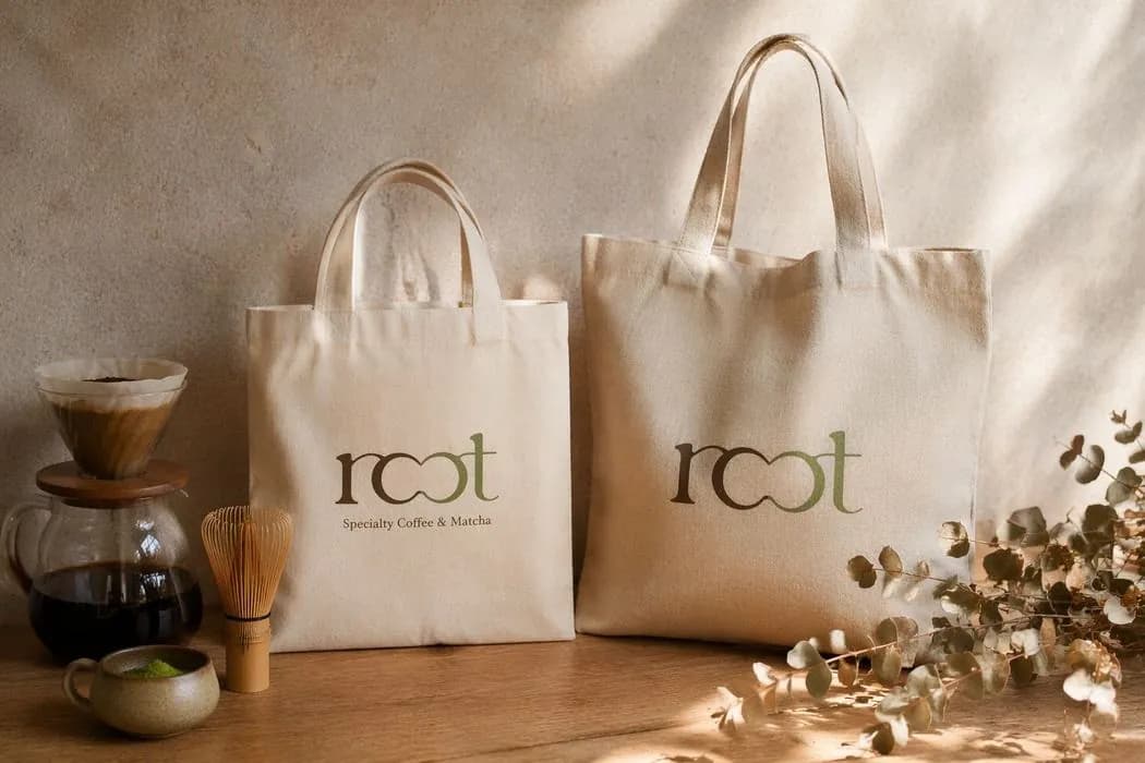
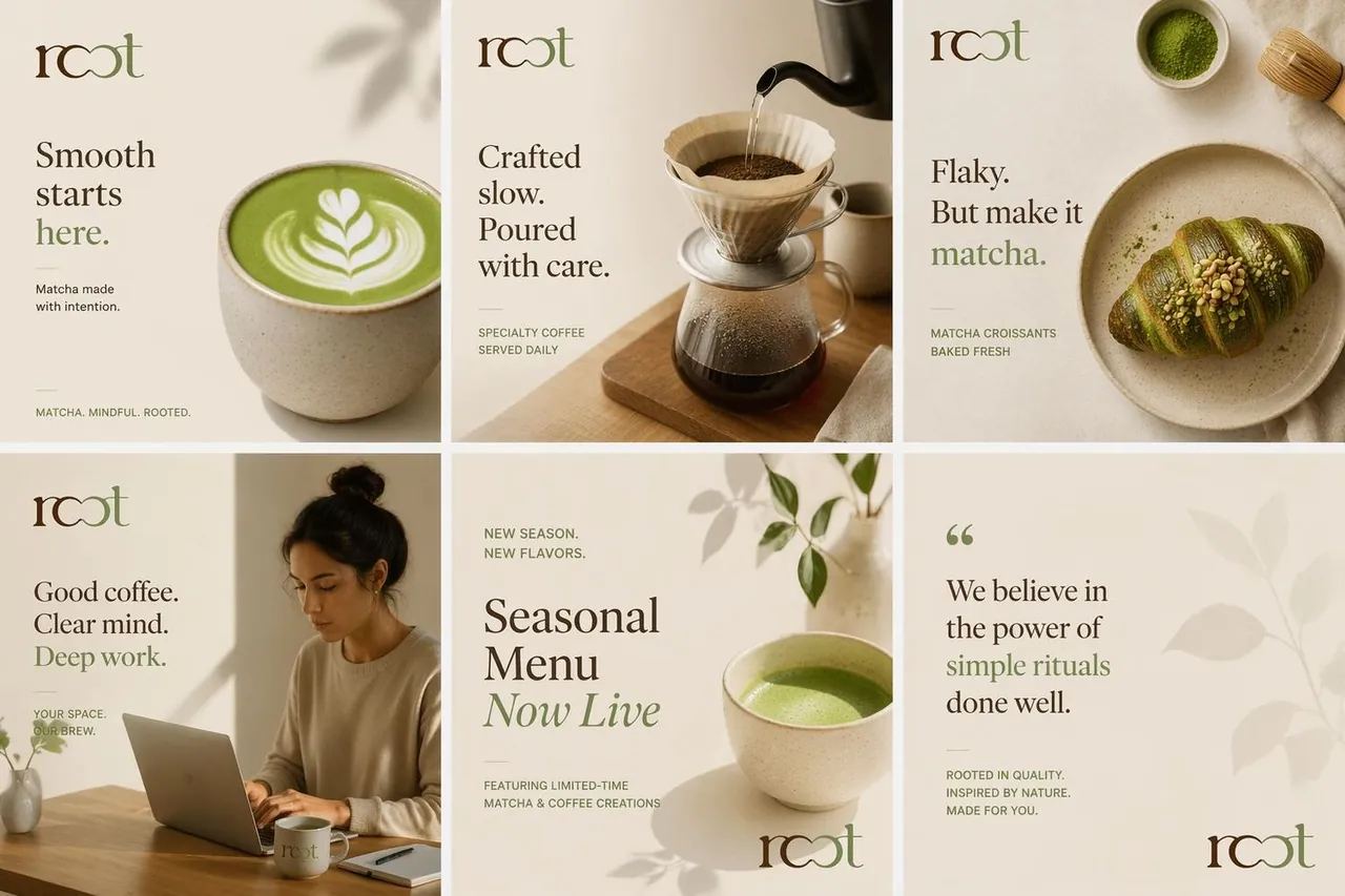
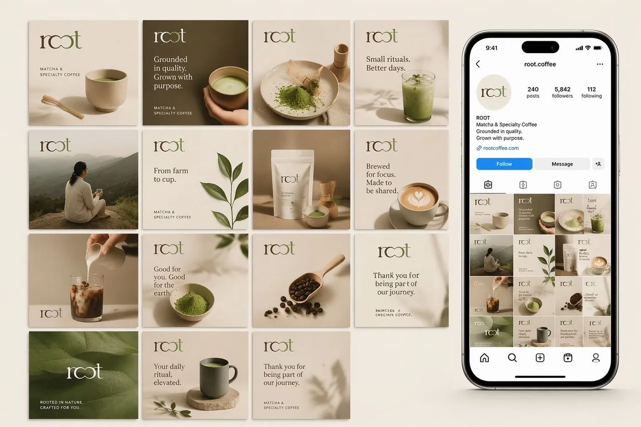
Root Café & Matcha Bar is a modern café brand built around calm moments, natural aesthetics, and mindful living. Inspired by organic textures, warm interiors, and the ritual of specialty matcha, the visual identity combines earthy tones, elegant typography, and minimalist design elements to create a welcoming and sophisticated experience.
“A brand built around the ritual of slowing down.”
Specialty cafes compete on noise. Louder colors, busier walls. Root wanted the opposite: an identity as calm as the ritual it serves.
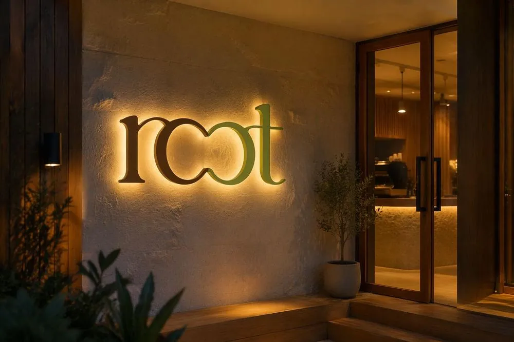
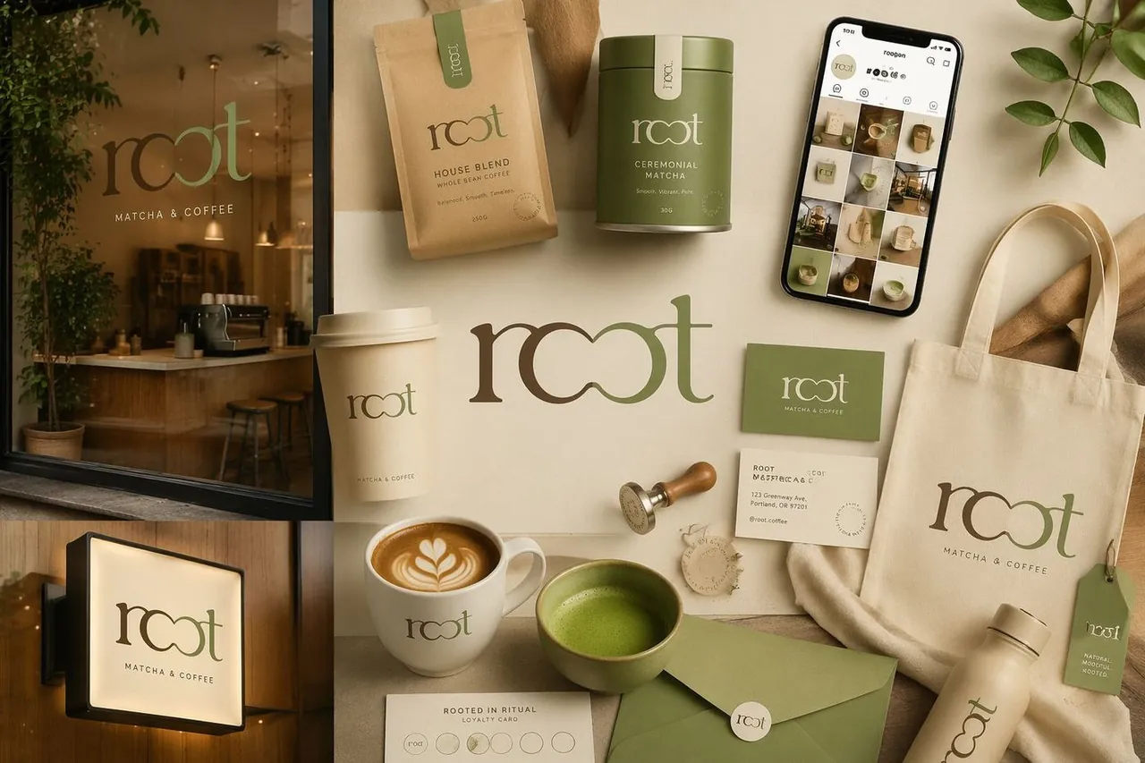
The two o's of the wordmark merge into one continuous loop: a root system, a shared table, a moment of pause. Growth from a still center.
A lowercase logotype with letterforms that loop and link into one another like roots under soil. The rounded weight keeps it calm and organic, and the color is pulled straight from the cup, matcha green over coffee brown.
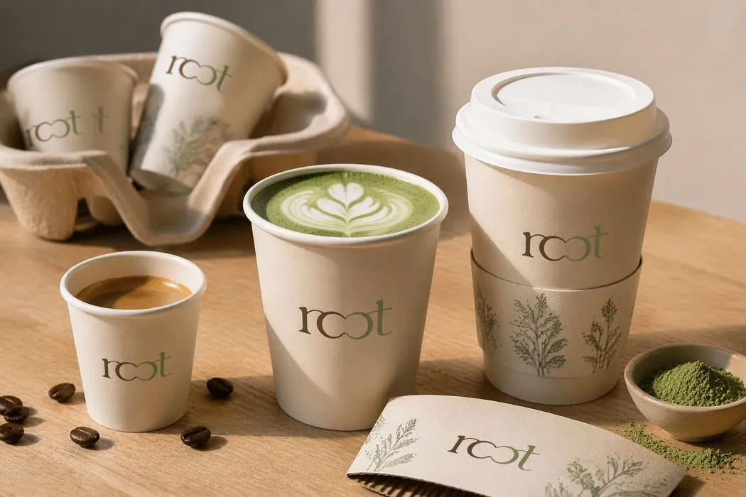
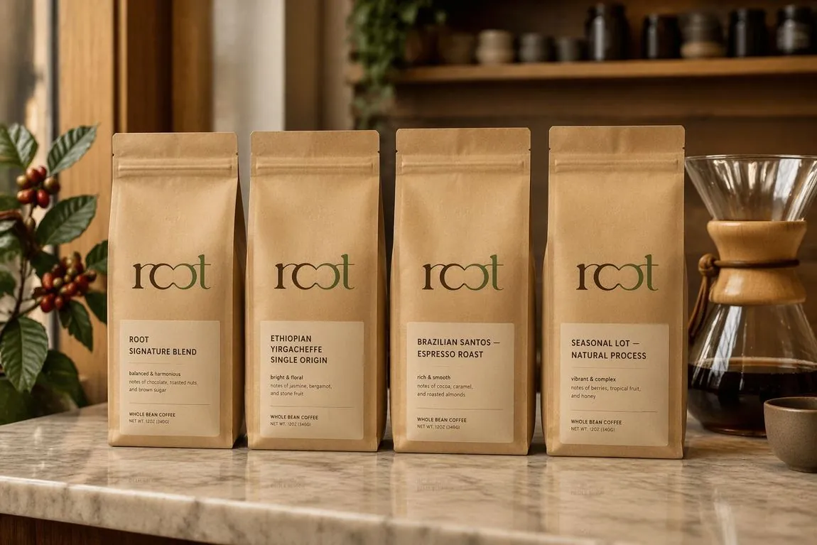
A palette drawn from matcha and coffee, green meeting roasted brown in the logo itself. One glowing dimensional sign as the only loud gesture, and unbleached cups, pouches and tins that let texture do the branding.
A rounded lowercase logotype with a light grotesque doing the quiet work on menus and labels. Nothing shouts, the type drinks slowly.