Brand Identity · Packaging Design
Foaming Factory
A little foam. A lot of personality.
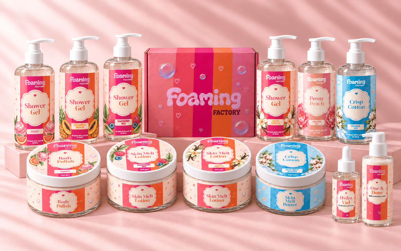
A playful identity for a skincare and body-care brand, bringing together bubbly lettering, colorful stripes, and delicate illustrations. From bottles and jars to boxes, the packaging gives each product its own personality while keeping the entire collection recognizably Foaming Factory.
“Turning everyday care into something to look forward to.”
Create a memorable skincare identity that feels joyful and approachable, with a consistent look across different products, scents, and packaging formats.
Capture the lightness of foam and the pleasure of self-care through soft shapes, cheerful colors, and illustrations that give each product a distinct mood.
The rounded, flowing “Foaming” wordmark echoes the softness of bubbles. The smaller “FACTORY” beneath it adds contrast and anchors the playful lettering.
Colorful stripes, decorative frames, and floral and fruit illustrations bring detail to the packaging. Consistent label layouts connect the collection, while changing colors and imagery distinguish each variation.
Expressive lettering gives the logo its personality, while serif product names add an elegant touch. Simple supporting typography keeps the product information clear and easy to navigate.