Brand Identity · Jewelry
Bijou
Jewelry, Detail & Emotion
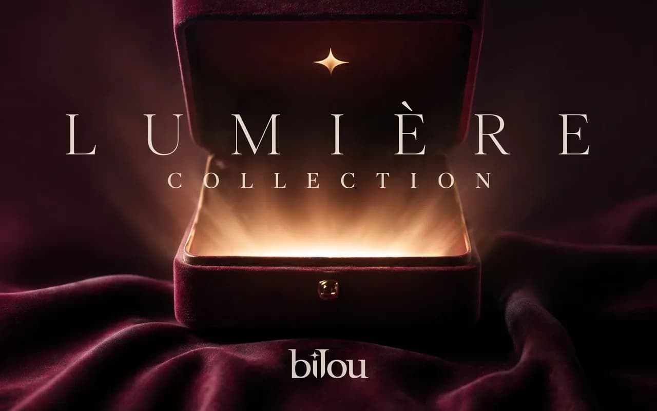
Bijou’s identity is inspired by the way jewelry catches the light and holds meaning. An expressive serif wordmark features a delicate star detail, while deep burgundy, soft ivory, and champagne accents create a warm, elegant palette. Across the packaging and Lumière collection visuals, the identity celebrates the anticipation of opening a jewelry box and discovering something precious inside.
“For moments worth keeping.”
Bijou needed an identity as precious as what it sells: elegant enough for fine jewelry, warm enough to feel like a gift.
The moment a jewelry box opens and the light catches what's inside. Every piece of the identity is built around that small spark of anticipation.
A lowercase serif wordmark with a small four-pointed star above the j, a glint of light sitting right inside the name.
Deep burgundy with soft ivory and champagne accents, carried across ring boxes, shopping bags, envelopes, business cards, in-store displays, social posts and billboard visuals.
An expressive high-contrast serif for the wordmark and headlines, with widely tracked capitals for collection names like Lumière.