Merci Market
Neighborhood Retail Brand
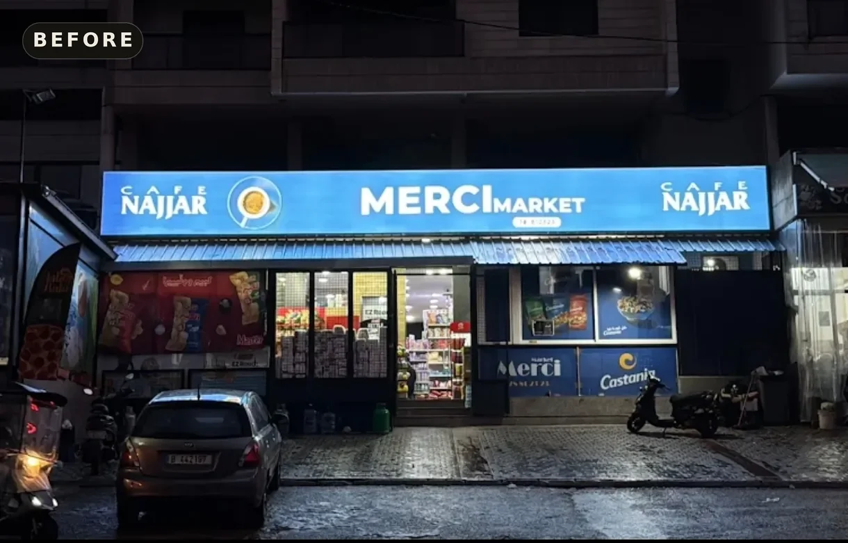
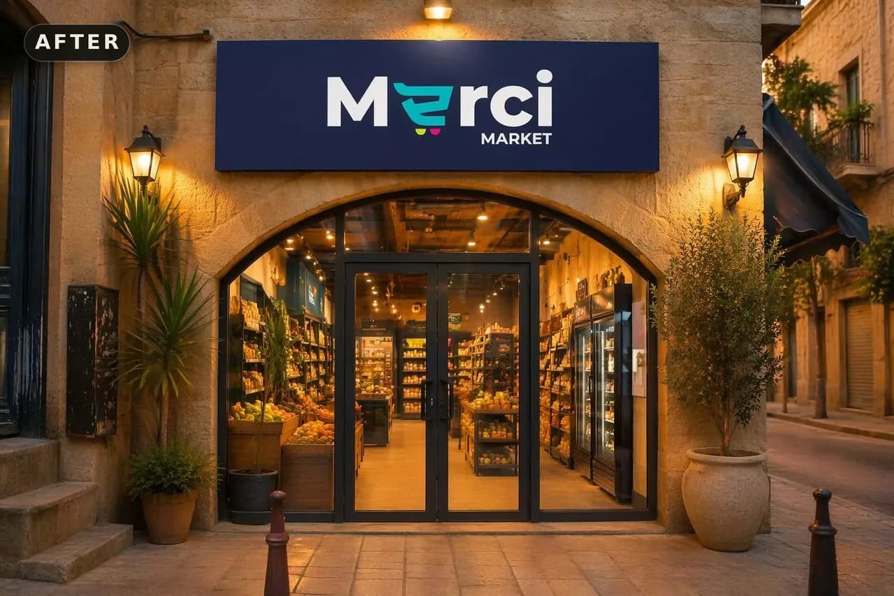
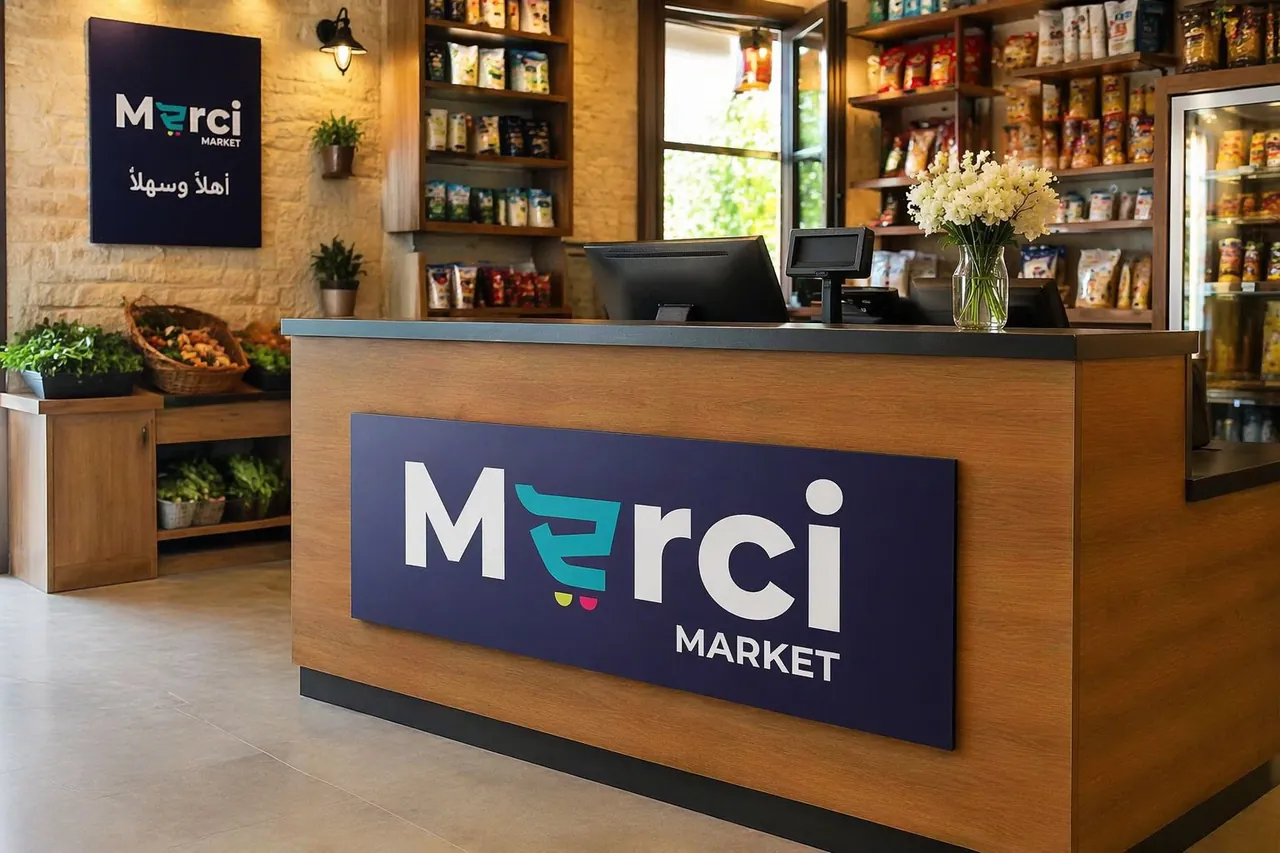
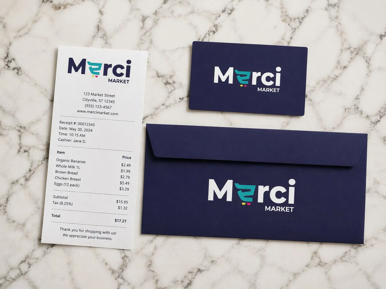
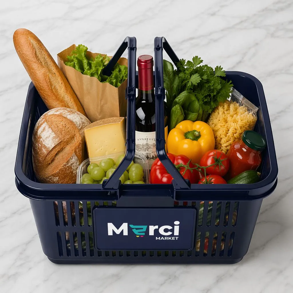
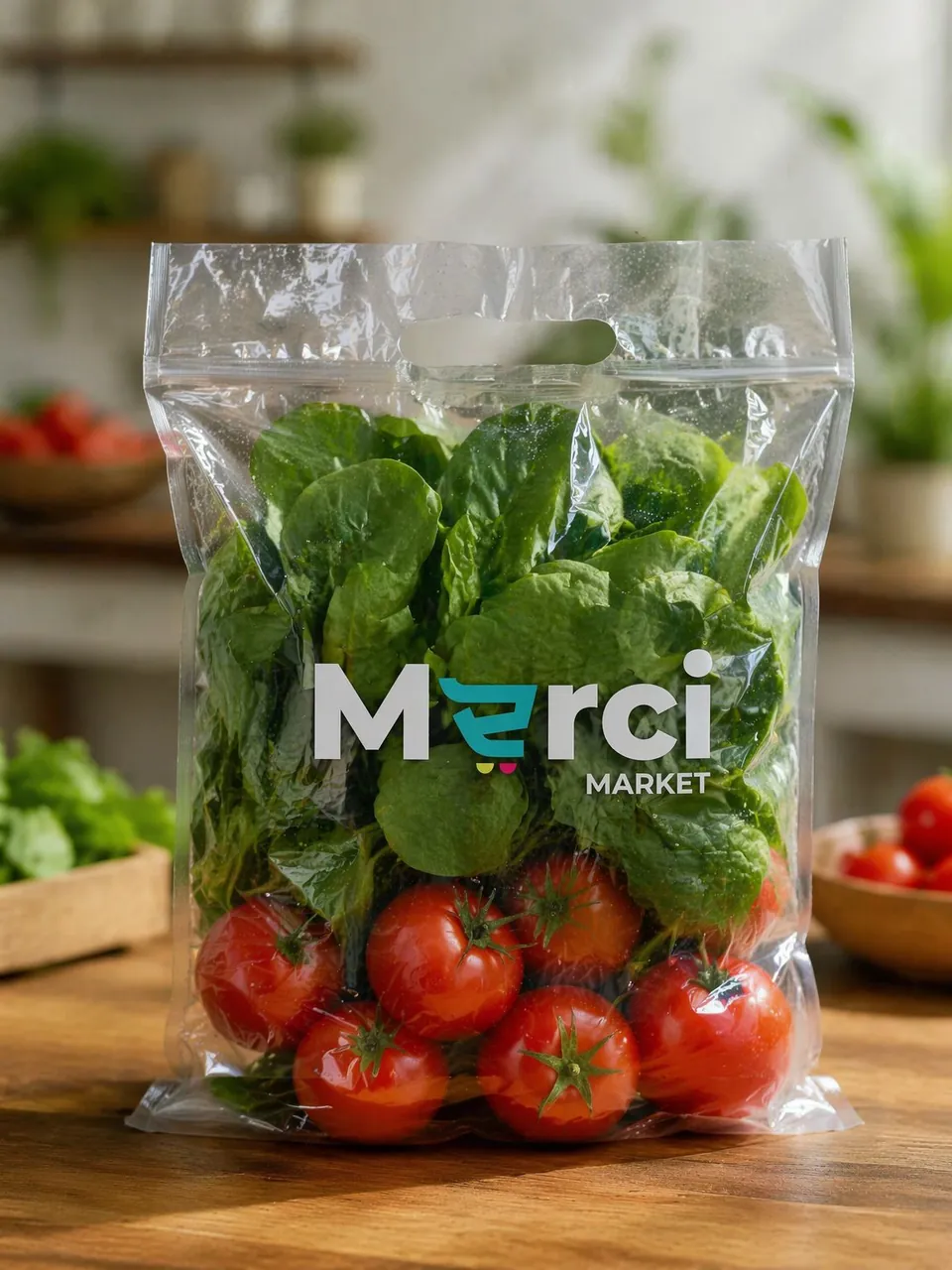
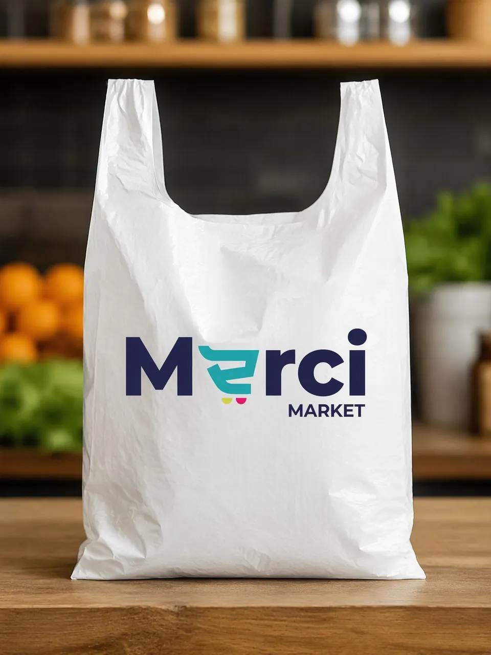
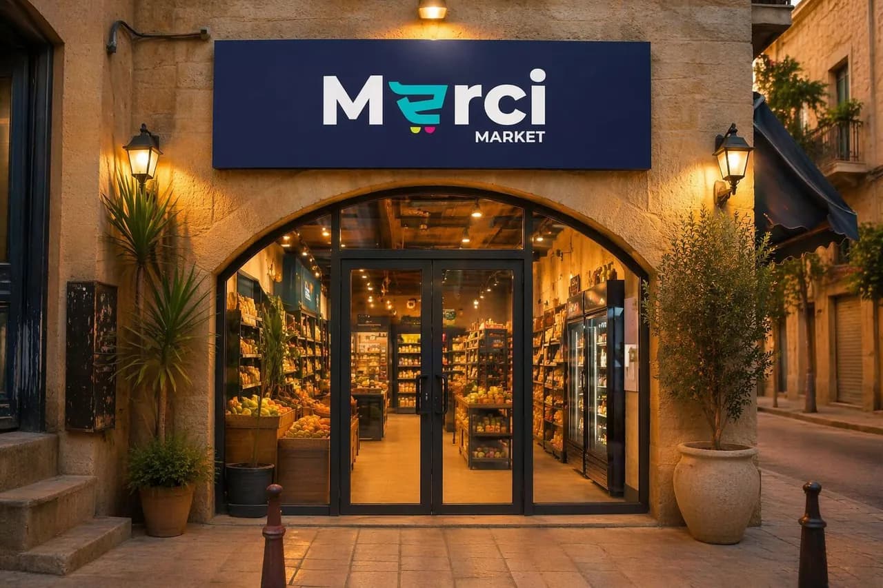
Merci Market was reimagined as a modern neighborhood retail brand that combines convenience, accessibility, and community. The new identity features a distinctive shopping-cart-inspired logo, bold signage, branded packaging, and a cohesive digital presence.
“A neighborhood staple, redesigned for today.”
A beloved neighborhood market needed to feel modern without losing the warmth that made people loyal in the first place.
The shopping cart becomes the icon, not the afterthought. A friendly, rounded mark that says 'welcome' before it says 'retail'.
A stylized cart wheel rendered as a smiling arc, paired with a warm wordmark that balances approachability with clarity.
A cheerful yet refined palette applied across bags, signage, uniforms, and digital touchpoints. Every interaction feels considered.
A rounded sans-serif that reads warmly at every scale, from shelf tags to storefront.