Carneo
Premium Meat Experience
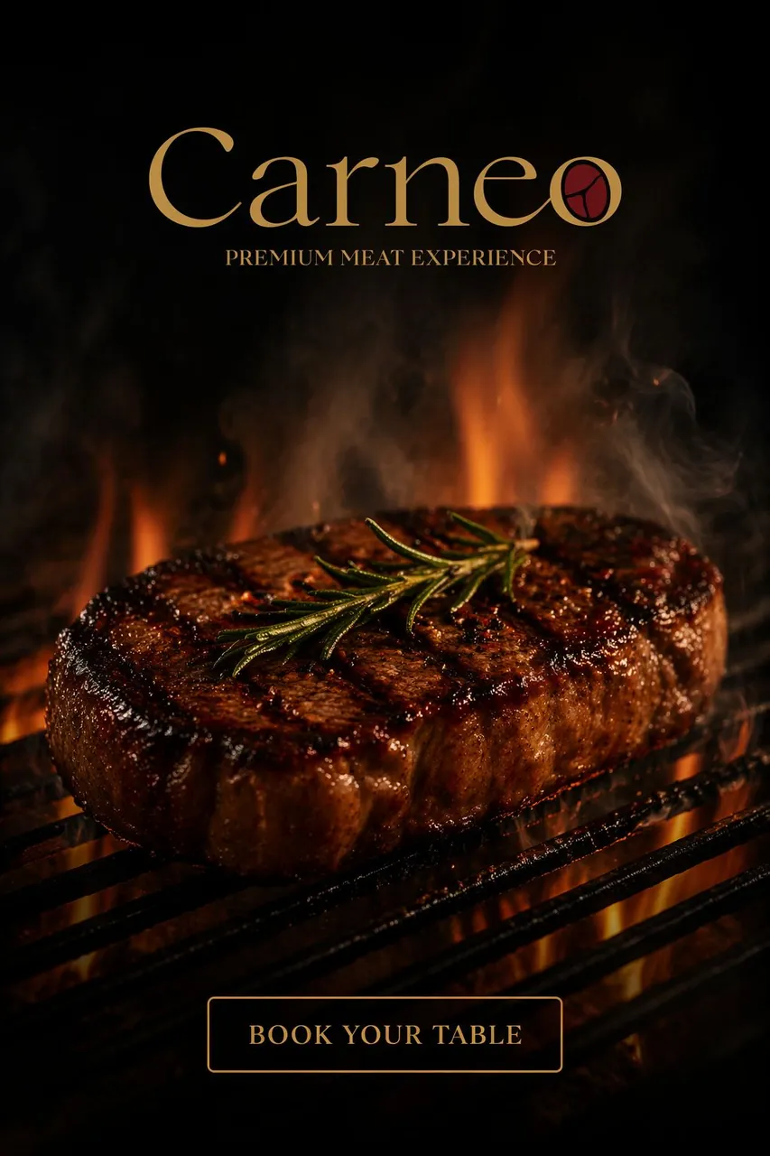
Carneo is a premium meat restaurant in Lebanon that had outgrown its first logo. The rebrand replaces clip-art knives and flames with a confident gold serif and a mark drawn from the product itself.
“A steakhouse identity cut to premium grade.”
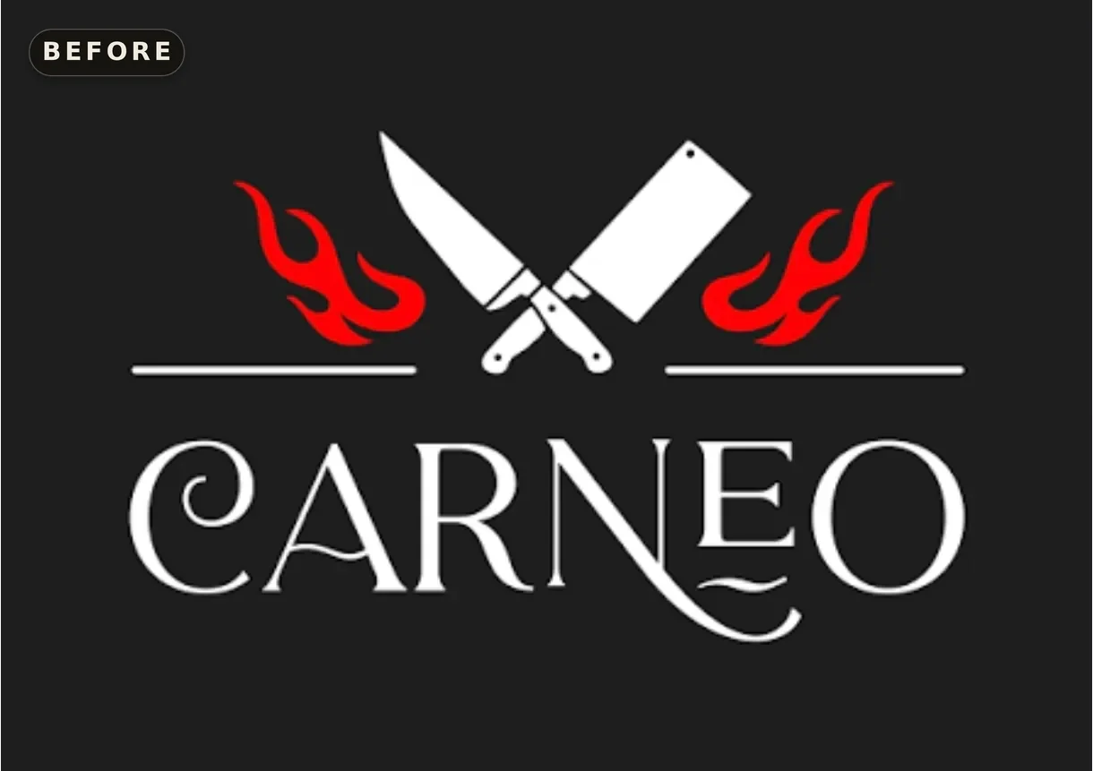
Carneo's original logo said butcher shop: crossed knives, cartoon flames. The restaurant underneath was positioning itself as fine dining.
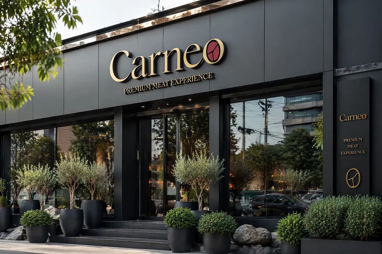
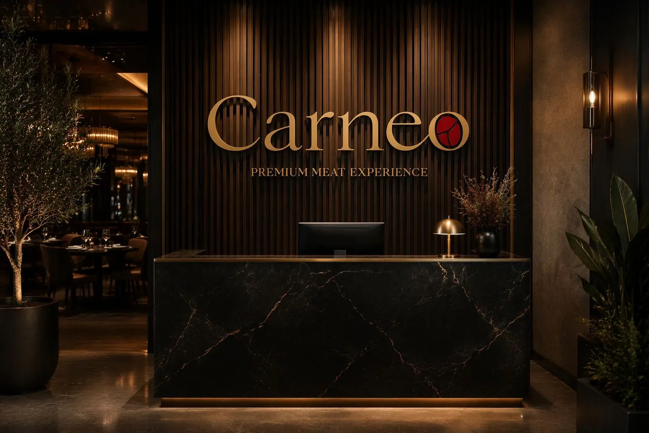
The o of Carneo becomes the product itself, a marbled cut of beef drawn as a simple seal.
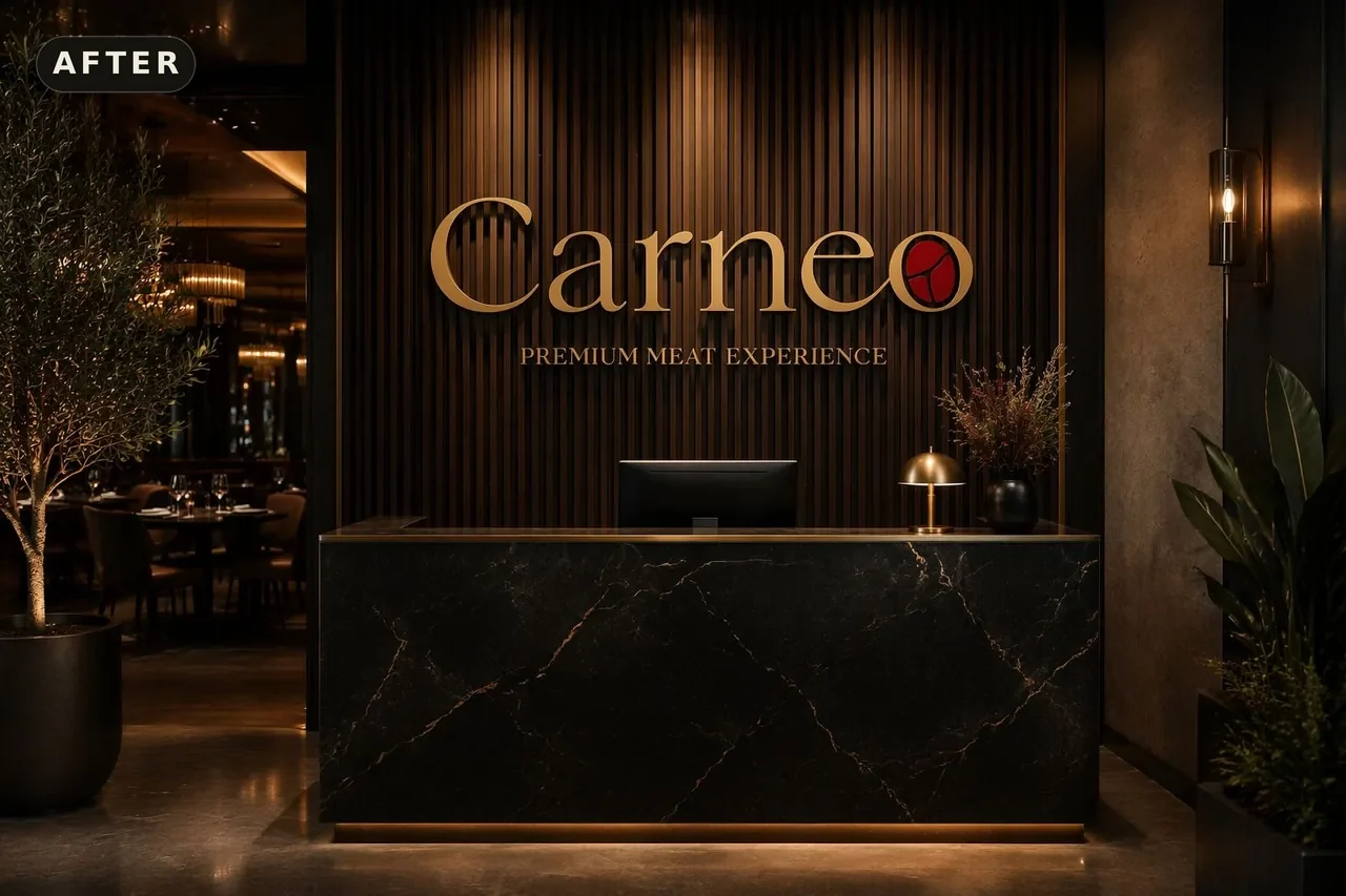
A refined serif logotype with a meat seal set inside the final o, the only place the deep red appears.
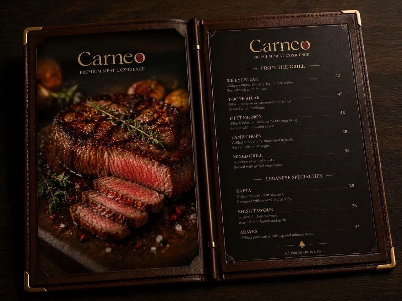
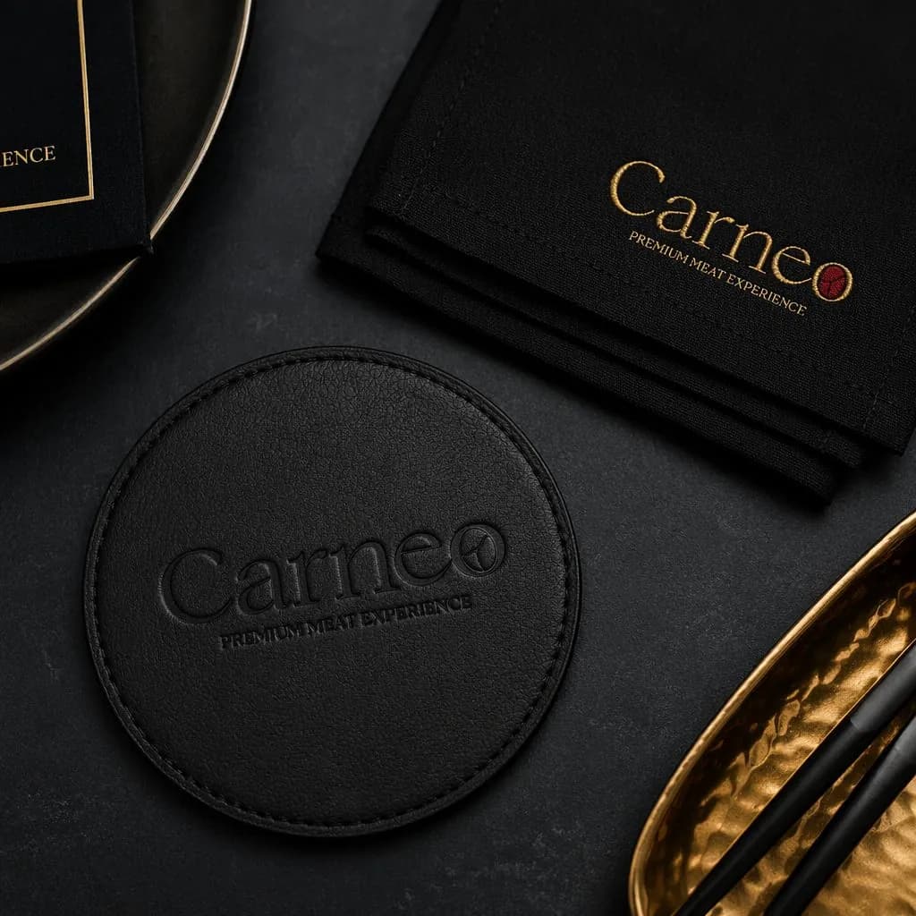
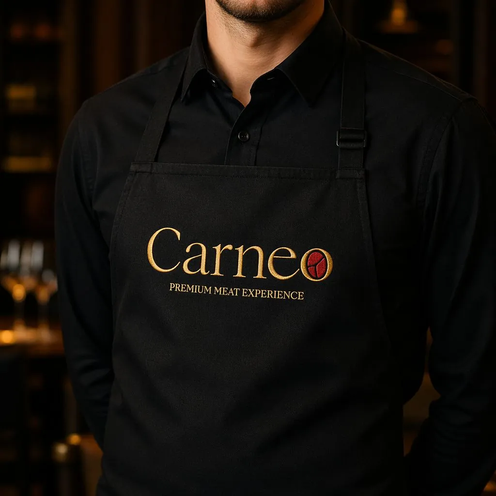
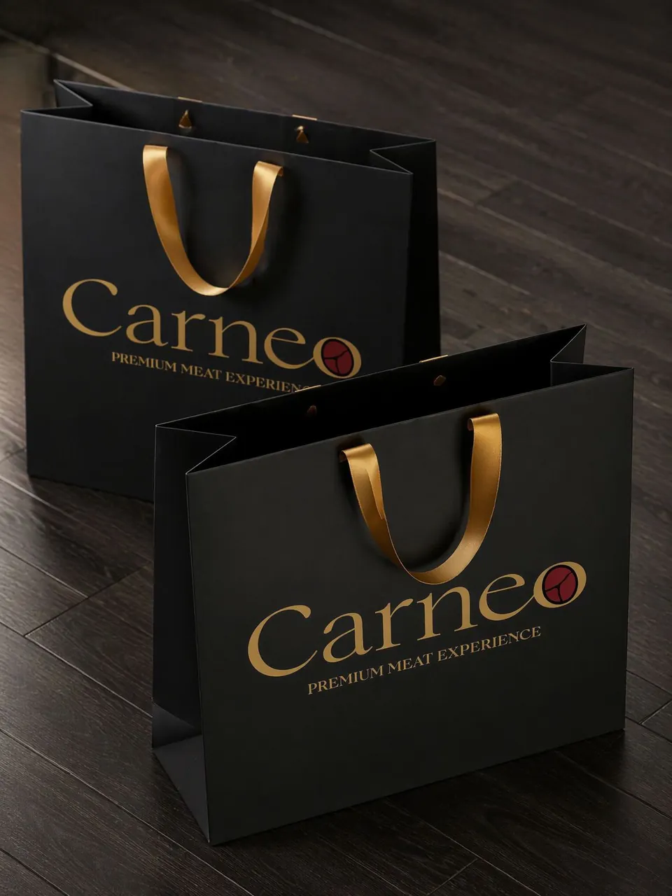
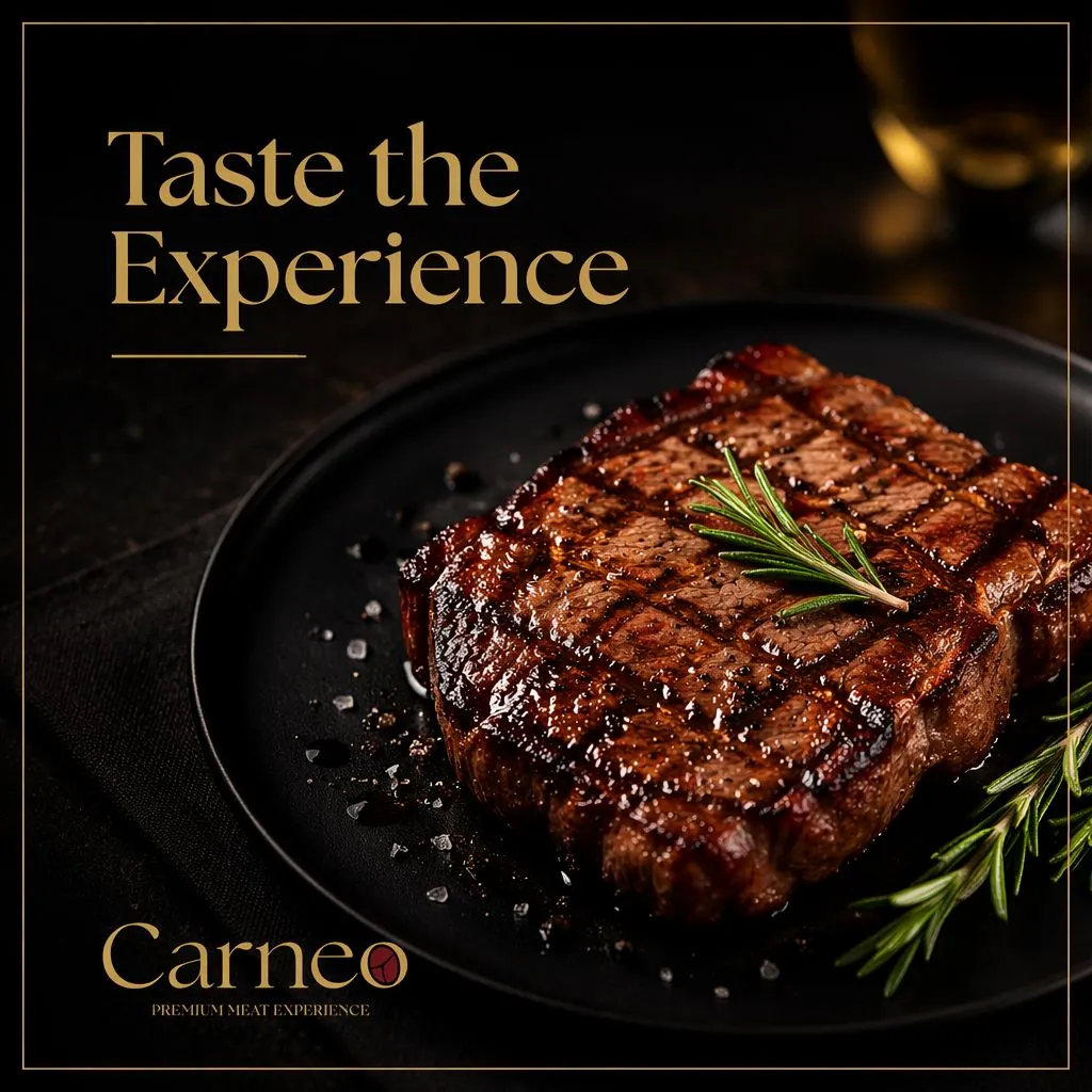
A black and gold system with deep red reserved for the mark alone. Embossed leather and embroidery, a menu pairing prime cuts with Lebanese specialties.
A refined high contrast serif carries the name, supported by small tracked capitals for menus and detail lines.